15 July 2015
What’s your favorite opening?
A captivating title sequence is an integral part of how the audience experiences a story. It’s an introduction to the world, the characters, and the themes of the show. It has to look great, set the tone, and be eminently re-watchable. We like to think of it as the branding of the show and it should be a treat week after week, a beautiful fusion of design and storytelling that welcomes the viewers and is always a pleasure to watch.
This wasn’t always the case: earlier television shows sought to simply introduce characters faces and show clips from the show. Which, fine, sure, it works. But these days, us viewers like to be entertained from start to finish. And opening credits should look and feel epic.
Quite a challenge but there are a couple of pretty cool agencies out there specializing in the art of opening credits. Our three favorite agencies are Elastic (True Detective, Game Of Thrones), Prologue (American Horror Story) and Christopher Webb Films (Dexter, Penny Dreadful).
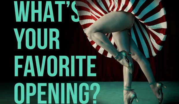
True Detective
The opening titles for the first season of True Detective were mesmerizing and instantly iconic. Season one’s titles included several images of anonymous female bodies: a bare ass pressed against spiky high heels, a topless woman floating in water, a heavily mascaraed blinking eye, a dancer in an American-flag bathing suit.
The opening credits were designed to “reveal character through location” through the conflict between the choking pollution and the languid water, the grimy prostitution and the enraged, shouting evangelists. The images are very evocative of California, but there seems to be less an emphasis on inner turmoil and more an emphasis on large-scale placement, less who am I? and more which part of the puzzle am I?
Click here to watch the opening credits of True Detective (season 1).
American Horror Story
The title sequence is like a mystery,’ says Ryan Murphy (creator). ‘By the time you see the ninth episode of this season, every image in that title sequence will be explained. So for example, What are the jars in the basement? What is the mystery of the floating white Christening dress? Why is somebody holding hedge clippers that are bloody? Each time you watch it and you watch the week’s episode you’ll be able to say, Oh that’s why that’s in there!’
Each week we’ll slowly begin to understand more of the titles as the story is filled in around them and, conversely, maybe we can study the titles and try to figure out where the show might be headed or the possible significance of not yet shown objects or images. Either way, when it all boils down you have to ask one question, do the titles effectively communicate the series and secondly, do they kick-ass? The answer to both in this case? Yes.
Penny Dreadful
For their series Penny Dreadful, Showtime invited cinematographer Christopher Webb to create sensuously macabre imagery for the show titles and packaging. Working closely with Showtime, Chris’s team assembled live action talent, props, and SFX makeup artist Anthony Pepe for a shoot at CW Films studio.
Chris employed in-camera effects including: custom built motorized lighting rigs, flexible mirrors, puppetry, prop motion rigs, liquid tanks, and specialty lenses to evoke the show’s atmosphere of mystery and unease.
Click here to watch the opening credits of Penny Dreadful.
At DEARDAN&Friends we believe there’s no better time to catch up on your favorite series than during the summer holidays. At least if you decided to stay here in the Netherlands where it’s raining 98% of the time. Especially for you we started a collection of the best opening credits of all time. Feel free to join in and share your favorite series with us on Pinterest:
DEARDAN&Friends
Make it simple but significant.
Special thanks to Elastic, Prologue and Christopher Webb Films.